Monday, March 5, 2018

Good Chemistry: Match Your Fragrance to Your Vibe

entry-mlaZXmdJ-627186.jpg

By: Casha Doemland

As if walking into Target to purchase the one item you need wasn’t hard enough. Now Target is creating exclusive collections, sure to have you wandering the beauty aisle swiping things off the shelves and into your basket.

Last year, Target seriously upgraded to Tar-jay with the launch of K-Beauty Collection, The Honest Company by Jessica Alba and a celebrity haircare line by Kristen Ess. As of this past January, your favorite store now has an exclusive fragrance brand.

Inspired by different vibes and personalities, Good Chemistry features 4 collections: Confident and Charming, Good and Grounded, Vibrant and Playful and Cool and Collected.

entry-mlaZXmdJ-627184.jpg
entry-mlaZXmdJ-627743.jpg

If you’ve got a hot date and are looking for a little something-something to boost your mood, the Confident and Charming collection has got your back. Allow the sweet fragrances of Gardenia Palm, Jasmine Rose and Magnolia Violet help channel your inner goddess. To sweeten the deal, the packaging is chic and simple with pastels, hand-drawn florals and gold text.

entry-mlaZXmdJ-627182.jpg
entry-mlaZXmdJ-627741.jpg

If you’re the homie who meditates in the relaxing presence of Mother Nature, Cool and Collected will bring you to the point of serenity with a simple spritz. Each scent and packaging highlight one of Earth’s natural treasures, from glaciers and the coastline to the desert and rustic woods.

entry-mlaZXmdJ-627740.jpg

If you’re feeling quirky and looking to channel a mood, Vibrant and Playful is right up your alley. Roll on a little Day Dreamer to match your hint of longing and allow your head to disappear in the polka dot clouds found right on the packaging. Prefer to be a Wild Child, mischievous and bright? Spray a little and transcend into the field of colorful flowers.

entry-mlaZXmdJ-627183.jpg
entry-mlaZXmdJ-627742.jpg

Lastly, if the heavenly aroma of walking through a garden is your happy place, Good and Grounded is the collection for you. Between the vibrant packaging with silver lettering and the scents of Apricot Bloom, Blue Bell, Sugar Berry and Water Lily, you’ve got everything you need.

Every one of these great scents is vegan and paraben-free and comes in a perfume, body spray and roller. Guess what? The price packages range from $9.99 to $24.99! Props to Target for making affordable, fabulous smelling fragrances.

entry-mlaZXmdJ-627185.jpg
Untitled design (2).png

Casha Doemland

LA-based and Georgia-bred, Casha Doemland spends her days crafting poetry and freelance writing. Over the last two years, she’s been published in a variety of publications and zines around the world. When she’s not nerding out with words, you can catch her watching a classic film, trekking around the globe or hanging out with a four-pound Pomeranian.


Thursday, March 1, 2018

Shipping books? Heres your Ultimate Book Packaging Guide.

The nation has been covered in a white dusting of snow this week (and there’s even more to come) – and what with it being World Book Day 2018 we thought there is no better time to cosy up next to the fireplace and read your favourite book – or in this case, revisit our blog post on the correct way to package books safely for sending in the post.


You’ve all seen it. That book trader that has a good old whinge on the forums about unreasonable customers leaving them negative feedback or demanding a refund because the book they’ve bought hasn’t arrived via the mail in pristine condition. That trader is clueless as to why their website, eBay or Amazon account is littered with poor feedback, and why their business is failing to pick up.

Make sure that trader isn’t you! Get your book packaging right first time!

Book packaging shouldn’t be a mission in DIY craftsmanship or a lesson in sliced-thumbs. Nor should it be an opportuntiy for your competitors to steal what is actually an easy win from underneath you. Sometimes when seeking guidance on how to do something, Google and other search engines can be your friend. Not in this case. When searching online for ‘book packaging tips’, ‘book packaging guide’ or ‘how to package books’ / ‘how to ship books’, the results are less than brilliant. Here are some of the (not sure why?) top-ranking results on how to package books in the mail:

As you can see advice on how to package books in the mail is varied, both in actual advice and quality of advice.  It’s also mostly completely wrong.  The best way to look at how to mail books profitably and efficiently is to look at businesses that have built their success on mailing books.  Businesses like Amazon.  What kind of packaging do they use to mail books every second of every day all year? WHY do they use the methods they do?

First of all, let’s look at the key challenges that books face when being sent through the mail:

book-cond_cover-damageImpacts:

Whether it’s a hardback, a paperback, a textbook, a comic book, or a journal – all publications of any type are vulnerable to being knocked about in the mail.  Whether it’s a mailing system automated ‘runner belt’, or an overzealous postman, books can and do take impact damage.  This impact damage can be caused by something knocking into or onto the package containing the book, or it can be an impact inside the packaging itself, where the book has gained momentum and crashed against the packaging meant to protect it. For rare, fragile, or hardback books, this is particularly important.  They often feature cover ‘overhangs’ with delicate paper-sleeves and carefully crafted bindings. One knock, one corner crush, one crease, can render the value of these books both monetarily and perceptually lessened.

Gouges & Cuts:

Whilst technically an impact, gouges and cuts deserve their own mention, because they require specific catering for when deciding on what type of packaging to use.  No book trader or dealer wants a book to turn up to a clients door with a big gouge in the cover or worse, sections ripped or cut off. So you need to protect against this.

book liquid damagedLiquids:

Oh the horror! Whether it’s grease, water, a spilt drink or anything else liquid – books, comics and other printed media do not play well with liquids of any form. So your packaging options need to consider the ‘what if’ regarding spillages near your product. (Yes, you’re right – spillages in the post logistics chain shouldn’t be a concern for you, but it all depends on how far you want to protect your products.)

Security:

Some books are worth a lot of money. Some are simply valuable to people for other reasons. Either way, the greater the perceived value of a book, the more at risk it is to being pilfered.  Making sure that the packaging is not easily accessible (or the contents viewable) to ‘chancers’ doing some light-fingered shopping, is a crucial point.

Ease of Opening:

If your customer needs a PHD or a chainsaw to open your book packaging, then there is a chance that you have gone a little too far in how you have packaged your book. Yes, protect it – but at the end of the day the customer needs to be able to get into the packaging without risking damaging the contents by doing so.

Sustainability:

Who cares about the environment these days? Nobody right? Wrong actually. Sustainabaility of packaging is a huge issue – and your greener more aware customers (they’re book readers!) will most likely prefer you to be using recyclable or non-landfil-destined packaging. Sustainability and plastic bubble-mailers just don’t go together, no matter what the manufacturers or your packaging dealers say.

Postal Costs:

Finally, a consideration that is NOT all about what your customers wants! Simply put, the more packaging you use, the heavier and bigger your packaged book is going to be. So instead of just piling more packaging on, you need to be smarter about the design of the packaging you use, and how much of it you use. Many countries operate volumetric costing for posting things – including both weight and size. Some just go by weight (Books can be really heavy!). For example, in the UK the Royal Mail uses volumetric cost assessments, and operates a volumetric tariff system. If you slip into a higher volumetric tariff because your packaging is either too big or too heavy, you’re paying for a postal tariff that you shouldn’t be. This is one of the simplest and most effective ways to keep that all important margin on your book sales, or to reduce your price in the market – both effective tactics for succeeding!

Parcel AppearanceAppearance:

When packages turn up looking like they have crossed a battlefield, were put together by the wombles from loose cardboard in a bin, or like you just don’t care about the customers ‘unboxing experience’; then Houston, we have a problem. As soon as your package enters your customers world, they’re judging you. If it looks shoddy, or badly thought out, then they will not be pleased.  The more you value your initial impression to the customer, the more they will think “WOW!”.

You can bet your bottom dollar that Amazon will have thought of all of the above when mailing books to customers. You don’t get to be a huge, world-beating organisation like Amazon unless you focus on things like book packaging and protecting your products during transit. If you have ever received a book or other publication that has been fulfilled by Amazon, then you’ll know that they use two key types of packaging for books and printed media:

  1. Envelopes
  2. Bookwraps

Why do they do this? Companies like Amazon know that well made packaging that is specifically designed to cater for the crucial factors listed above is far better for protecting books in transit, and is also more cost-effective and efficient for the business. Spending time, money and energy cutting up pieces of cardboard, and taping or stapling it together with reams of plastic sheeting and bubblemailers just does not work. It’s a false economy – especially if you’re unnecessarily paying higher rate postage costs. If you want to be a back-room homestead book trader, then continue making or assembling your own packaging. If you are serious about your business, take a tip from organisations like Amazon – use ready-made book packaging to ship your books, comics, journals, textbooks, and anything else containing the all important written word.

As you’ll see if you visit our product pages, our envelopes and bookwraps (and also our flatpacks) are specially designed to cater for most of the above list – with the obvious exception being liquid resistance – which is why it is worth sealing more expensive or rare items inside a plastic waterproof envelope before being transit-packed.

Good luck in your Book Packaging endeavours! I hope this guide has been helpful to you in making better book packaging and shipping decisions.

BUY BOOK MAILERS HERE

SaveSaveSaveSaveSaveSaveSaveSaveSaveSaveSaveSaveSaveSaveSaveSaveSaveSaveSaveSave

SaveSave

SaveSave

SaveSave

SaveSave

The post Shipping books? Here’s your Ultimate Book Packaging Guide. appeared first on Lil Packaging.


via Blogger Shipping books? Here’s your Ultimate Book Packaging Guide.

Shipping books? Heres your Ultimate Book Packaging Guide. syndicated from https://www.lilpackaging.com/

Shipping books? Heres your Ultimate Book Packaging Guide. published first on https://www.lilpackaging.com/

Rico Chico Chocolate Comes With Illustrations as Bold as The Flavors Themselves

19.jpg

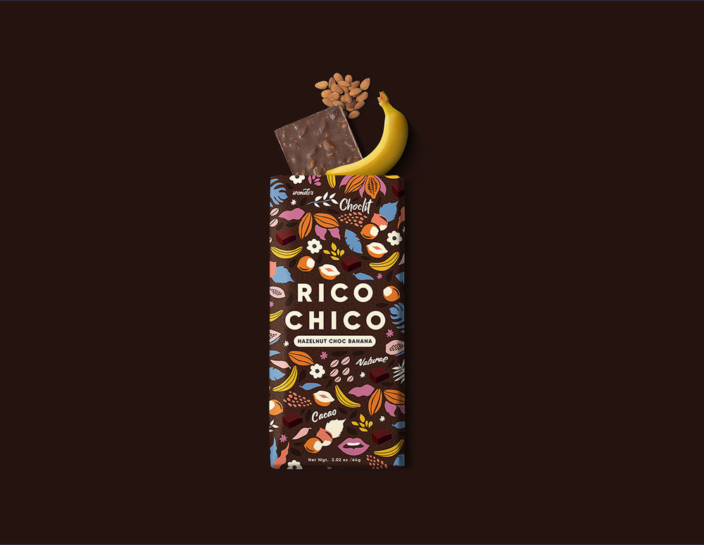
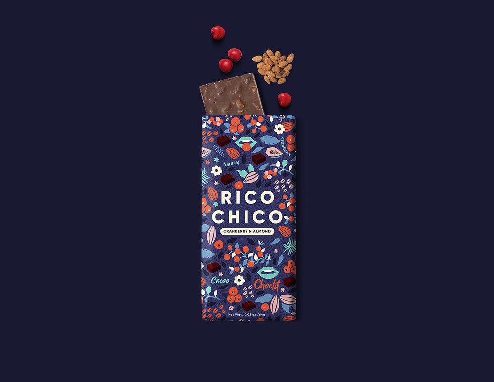
Meroo Seth designed this conceptual branding and packaging for Rico Chico, a chocolate brand. The design features bold patterned elements that attract the eye of the viewer and represent the different flavors of the chocolate.

1.jpg2.jpg3.gif7.jpg 9.jpg
11.jpg
13.jpg
15.jpg

“Branding and packaging design for Rico Chico. A brand that captures the absolute vision and optimistic outlook for rich cacao and natural fruity flavors in their ingredients. The brand is presented with a series of chocolates with 6 different fruit-based flavors, a mouthwatering blueberry orange to a hazelnut banana flavor which just melts in your mouth giving a rich taste. I have crafted a system that reflects the bright flavors and rich cacao quality of a good chocolate that you have never tasted.”

17.jpg16.jpg8.jpg6.jpg
10.jpg
12.jpg
14.jpg
21.jpg20.jpg  

Designed By: Meroo Seth
Location: India
 

These Brews Took Inspiration From Newspapers and Italian Sports

collage.jpg

London-based agency ByVolume created this old world inspired packaging for Brewfist’s line of Daily Brews. The designs were inspired by Italian sports illustrations making for a dynamic and eye-catching label.

LaBassa.jpg

CHALLENGE

Back in 2015 Brewfist challenged us to design the packaging for a stand-alone beer that could visually link to the world of Italian sports. Our answer was to create an old fictional cover of the popular sports newspaper Gazzetta Dello Sport, carrying its visual language, layout, vintage typography and the iconic pink colour. The sport making the headline could be nothing but cycling, with the name La Bassa referencing both the drop bars and the nickname of the local area where the brewery stands. The beer and label proved so popular that soon after we thought about how to turn a single beer into an entire new line of products in their portfolio.

grillotalpa_reflex.jpg

SOLUTION

We set the theme to be sports and newspapers, so any new entry to the line had to be inspired by a popular Italian sport and by the look and design of a newspaper, whether real of fictional. The names of the beers had to be chosen particularly carefully so that they could sound close enough to those of a newspaper or tabloid. The front illustrations draw inspiration from the Italian futurist art movement and its praise of speed and dynamics, while the custom lettering and typography creates a strong link to the past.

The name Daily Brews seemed particularly fitting here.

labassa_reflex.jpg
ilmontante_reflex.jpg
lamosca_reflex.jpg

RESULT

Daily Brews is being released for the first time in Rimini at Beer Attraction 2018 fair as a line of four products. The beers stand apart from the rest of Brewfist portfolio not only visually but also because they are ordinary, everyday products opposed to the more complex and hop-forward brews the brewery has become famous for.

Print
Print
Print
 

Designed By: ByVolume
Location: London

Striking the Balance Between a Little Bit Street Style & a Little Bit Luxe

IMG_0719-1920x1280.jpg

By: Theresa Christine

Who would have guessed the big 5-0 could look so good? Even after fifty years, the Adidas Superstar remains a best-seller, coming in at number four in sales in 2017. Duy Dao, a designer in Los Angeles, decided to give Adidas some special treatment with a concept design for its iconic shoe’s 50th anniversary.

“Respecting the product and doing good research was the key,” explained Duy. He wanted the design to have a perfect mix of luxury while also maintaining a bit of edginess—style, but also grit. So for inspiration, Duy turned to not only the brand but the shoe itself.

“My design approach was to focus on the shape and the blueprint of the shoe,” he said. “The Superstar is an iconic silhouette. Tributing its heritage was a big challenge.”

IMG_1455.JPG
IMG_1460.JPG
IMG_1438.JPG
IMG_1433.JPG
IMG_1432.JPG

The Superstar came out in 1969, offering consumers a low-top version of the Adidas Pro Model. Originally produced for playing basketball, the shoe became particularly well-known when Run DMC wrote a song called My Adidas, and the footwear became a must-have in the hip-hop scene. Fame plus a versatile design has made these “Shell Shoes” (called so because of the rubber on the toe box) a favorite of sneakerheads. And while the shoes were released in basic colors—black, white, navy, and red—Adidas now offers an array of colors, and you can even customize your own.

So how exactly do you go about creating a design for such a well-loved, recognizable product? Don’t complicate things. A shoe like the Superstar has gained fame for a reason, and a design needs to work with it rather than against it. “I think the shoe has gained a reputation, and it deserves to be recognized just by looking at simple gestures.”

superstar-2-1.jpg

What’s not so simple, though, is the color—a rich, vibrant blue which pairs perfectly with the straightforward design. This part proved to be the most challenging part of the whole project. “I ran through a stack of different shades of blue in the Pantone books,” Duy admitted, “and ordered so many blue samples papers during my research. It’s always frustrating when you are a perfectionist but the reward is worth it.”

IMG_0575-1-768x512.jpg
IMG_0665-2.jpg
IMG_0723-1.jpg
IMG_0611-1.jpg
IMG_0617-1.jpg
IMG_0661-1-768x512.jpg

Indeed, the hue is spot-on. Energetic and fresh, it exudes the same kind of “quintessential Adidas.” Plus, blue has been part of the Adidas brand, and Duy felt it was appropriate to incorporate it into his own design. “Who doesn’t love a hint of Yves Klein’s blue, am I right?” Duy asked.

While developing the packaging, Duy also wanted to go beyond the design and incorporate an experience into the project. “I felt like, for a special edition shoe like this, it would be such a great opportunity to link it to a bigger campaign,” he explained. “And that was when the idea of making the ‘Forever Young’ campaign comes in, and then it extended to the posters and invitations.”

IMG_0600-1-768x512.jpg

The complete concept comes together beautifully—from the colors and the fonts to the box and invitation you hold in your hand. What Duy loves most about it, though, is something you can’t quite put your finger on. “It’s the overall vibe, the feel of the project,” he said. “I think that’s a really important aspect of any design project.”


static1.squarespace-1.png

Theresa Christine

Theresa entered the world of design through The Dieline. With a background in writing and journalism, she has a passion for discovery and cultivating human connections. Her work for The Dieline is a constant journey to deeply understand all facets of the design process and to investigate what makes designers tick. Theresa’s writing has taken her snorkeling in between the tectonic plates in Iceland, horseback riding through a rural Brazilian town, and riding an octopus art car at Burning Man with Susan Sarandon as part of a funeral procession for Timothy Leary (long story). When not writing, she is planning her next trip or taking too many pictures of her cat.