Wednesday, September 26, 2018

Genius Gluten Free Is "Good For the Gut"

BB_studio_Genius_-_Beetroot_wrap_pack.jpg

Free-From bakery category leader Genius Gluten Free has unveiled two wraps as part of a new ‘Good for the Gut’ range of six products due to roll out this year, with design from London-based B&B studio. The first products to launch are the Genius Fibre Fest Beetroot Wraps and Genius Fibre Fest Kale Wraps.

In line with the Genius core range, ‘Good for the Gut’ products are entirely gluten and dairy free but with the addition of a natural prebiotic to appeal to the gut-conscious consumer. Each product in the range also has a stand out nutritional benefit: wraps that are 3 x fibre of regular wraps; pasta that’s 2 x protein and 3 x fibre of regular pasta; bread crisps with 2 x protein and ½ the carbs of regular crisp breads.

BB_studio_Genius_-_Good_for_the_Gut.jpg

Tasteful design

Moving away from the scientific-led design codes often adopted by brands in the Free-From and benefit-led category, B&B studio has introduced a bold, eye-catching colour palette for the new ‘Good for the Gut’ range, delivering a dynamic identity incorporating bespoke graphics and illustrations.

Focusing on depth of taste and flavour, B&B studio has created a range of original patterns in-house that take inspiration from the product ingredients, including layers of beetroot and swirls of kale leaves. These designs are presented on brightly-coloured backgrounds, providing differentiation for the new range and standout on-shelf.

BB_studio_Genius_-_Beetroot_wraps.jpg

Strengthening the brand

Building on the new brand identity for Genius Gluten Free delivered by B&B studio in October 2017, this vibrant brand extension incorporates the strong blue hue and instantly recognisable Genius logo, complete with a thought bubble or bitemark to express the imagination, creativity and tastiness of the Genius brand.

By incorporating these familiar brand elements into the identity for the ‘Good for the Gut’ range, B&B studio was able to retain the consistency of the brand whilst enabling more creative freedom across the wider design. Innovative structural packaging solutions ensure that the new products are not only aesthetically pleasing, but also convenient for the consumer.

BB_studio_Genius_-_Kale_wrap_pack.jpg

Building on success

Shaun Bowen, Creative Partner at B&B studio, says: “After the success of the new brand identity for Genius Gluten Free last year, we wanted to retain the consistency and recognisability of the brand whilst also creating vivid and engaging designs for the new range, strengthening Genius’ position as a market-leader, and enabling it to continue to challenge mainstream brands.”

Genius Fibre Fest Beetroot Wraps and Genius Fibre Fest Kale Wraps provide three times the amount of fibre, and one third less carbohydrates than a regular gluten-containing wrap, and include chicory root inulin, a naturally-occurring Prebiotic Fibre that contributes to normal gut function.

The Genius Good for the Gut range is available from Tesco in August, and Sainsbury’s and Ocado from September 2018.

BB_studio_Genius_-_Kale_wraps_info.jpg  

Designed By: B&B studio

Location: London, UK

The 6 Best, Up-And-Coming Beer Brands We Saw At The Great American Beer Festival

IMG_5416.JPG

By: Fred Hart

What happens when you check out some 800 breweries with over 3,800 beers in one day? Well, we found out the hard way when we attended The Great American Beer Festival (GABF) this past weekend in Denver, Colorado, on the hunt for the best “undiscovered” beer branding and packaging.

As we walked (and later stumbled) through the show, we saw plenty of Dieline familiars – from national craft players like Ballast Point and Dogfish Head – to young guns like Magnolia, Noble Rey and Bayou Teche. However, we were after the up-and-comers, the companies flying just under the national radar that deserve a little more of the spotlight.

They say the more you drink, the better-looking things get. No doubt the same holds true for packaging, but even while sober, these six brands shined the brightest.


Southerleigh

IMG_0579-e1476805877473.jpg
sthr_darwinian_6pack.png
sthr_gold_6pack.png
sthr_uncommon_6pack.png
 

Wiseacre

MAN21584.jpg
tiny-bomb.jpg
why-cans-beer.png
 

Two Roads

Craft beers and spirits (1).jpg
two-roads-beer-bus-variety-pack-cans-575x575.jpg
two-roads-tanker-truck-sours.jpg
tworoads-can.jpg
 

The Tank

tank-brewing-bottle.jpg
the-tank-la-playita__68239.1532634852.380.500.jpg
 

Rhinegeist

static1.squarespace-2.jpg
Rhinegeist-Cans-launch-in-Boston-BeerPulse.jpg
static1.squarespace-1.jpg
static1.squarespace.jpg
 

Hopfly

1-allcans.png
2-firstprioritycans.png
9-crowlers.png

FredHart.png

Fred Hart

Fred Hart is a Partner and Creative Director at Interact Boulder – a spirited branding agency obsessed with the food and beverage industry that’s fueled by a steady, 24-hour diet of tastemakers, entrepreneurs, grocery stores, farmers markets, restaurants and more. 

Lion Heart Kombucha Is Bringing a Bright and Friendly Vibe

lion-heart-kombucha-packaging-heros-blend.jpg

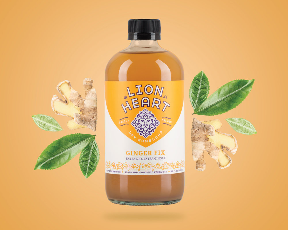
Murmur Creative created this bright and friendly packaging for Lion Heart Kombucha, a local Portland kombucha brand.

“Lion Heart Kombucha is a local Portland company, and has been making consistently delicious kombucha for years. Their kombucha is high quality, low sugar, and awesomely healthy.”

lion-heart-kombucha-line-up.jpg

“Lion Heart Kombucha is a longtime studio favorite, so we were absolutely thrilled by the opportunity to reimagine this unique beverage brand. Lion Heart liked the way their former logo incorporated a heart to represent love and positivity and a lion for courage and strength. While working on the rebrand we decided to steer away from the representational imagery of their former logo and focus instead on more symbolic elements. We wanted the logo to reflect the fresh and lively qualities of the brand in a more mature context. The lion’s face is secretive and wise, while the mane holds Lion Heart’s playful, more whimsical, qualities.”

lion-heart-kombucha-packaging-bliss.jpglion-heart-kombucha-packaging-blueberry.jpglion-heart-kombucha-packaging-jazzberry.jpg lion-heart-kombucha-packaging-ginger.jpg
lion-heart-kombucha-packaging-raspberry.jpg

“Using Lion Heart’s new brand identity as our guide, we developed new packaging for all six of their flavors. We also recommended a new tagline “Dry Kombucha” in order to call attention to their low sugar profile.

Inspired by the logo and the playful elements in the lion’s mane, which incorporates tea leaves and simple droplet shapes, we designed a custom flavor pattern for each flavor to adorn the bottles. These custom flavor patterns highlight ingredients specific to each flavor. Additionally, a large droplet shape is depicted on the front by using the rounded top of the glass bottle and the big color block behind the logo.”

lion-heart-kombucha-held.jpg  

Designed By: Murmur Creative

Designer: Zipporah Vannata

Client: Lion Heart Kombucha

Creative Director: Andrew Bolton

Photographer: Andrew Bolton

Printer: Rose City Labels

Location: Portland, Oregon


Fight Aging Skin with Dr. Loretta

DrLoretta_September-7.jpg

By: Casha Doemland


As you age, your skin does as well. You develop wrinkles, sun spots and the elasticity that used to snap back is now delayed or nonexistent. For some, that’s a hard pill to swallow and to combat it, they invest in skin care regimes and weekly facials or even switch up their diet and follow silly fads on the internet.

Dr. Loretta Ciraldo, a sought-after board-certified dermatologist with 40 years under her belt, has partnered up with a decade-old client, Myriam Zaoui Malka, an expert in Ayurvedic and Chinese medicine, nutrition and aromatherapy, to develop products that keep your face looking youthful and fresh.

FullCollection.jpg

The partnership began when Dr. Loretta presented her “skin exposed” concept to Myriam and asked if she would be interested in contributing her brand expertise and formulating products, as she had experience developing products and a brand of her own for The Art of Shaving.

For a year, the two, along with their husbands discussed the possibility of launching products under the name Dr. Loretta and decided to self-fund the anti-aging skincare line. Dr. Loretta’s daughter, Gina Ciraldo Stabile, even left her career as a lawyer to serve as CEO, which brings the business close to home.

DrLoretta_September-9 (1).jpg
DrLoretta_September-4.jpg

“As a dermatologist, my passion is helping women feel confident as they age,” says Malka. “That’s why I’ve created the first skincare line that protects from the four external factors – pollution, light, climate and irritants.”

According to their research, four factors play a roll in aging your skin.  Pollution both indoors and outdoors has been linked to age spots, while climate can deplete skin moisture. UVA light, as well as high energy visible light or blue light, can damage the skin and cause pigmentation or redness. Lastly, irritants can cause inflammations and even enhance wrinkles prematurely.

“We are a clean dermatologist line, and our medical grade actives are often ‘bio-inspired’ by naturally occurring ingredients or ‘bioidentical’ to naturally occurring components of young healthy skin,“ starts Dr. Loretta. “For example, we use a synthetic ingredient called Chromobright that is bioinspired by Vitamin E to be an effective fade ingredient that protects skin from damage done by UV and visible light.”

DrLoretta_September-3 (1).jpg

The brand avoids using unhealthy ingredients like sulfates, parabens, artificial dyes/fragrances, phthalates and triclosan linked irritations or inflammations that can result in the breakdown of collagen and ultimately accelerate the aging process.

Malka also served as the creative lead for brand creation, packaging, website and social media. “I had a very precise vision of using a clay color palette with a matte, soft-touch texture to evoke a delicate, natural and confident woman’s personality for Dr. Loretta’s brand,” says Malka. To achieve the brand’s medical and feminine feel, Malka chose pastel pink, grey and white for the brand’s distinctive look.

“My design philosophy is ‘less is more,’” adds Malka. “I was looking for soft curves and a bare, sleek style.“

DrLorettaGroupRow_ALT.jpg
FullCollection_Vertical.jpg
DrLoretta_September-EX-2.jpg
DrLoretta_September-6.jpg
DrLoretta_September-12.jpg
DrLoretta_September-EX-1.jpg

From there, symbols depicting the four types of external factors were created and placed on the containers and packages to let consumers know which products helped with the aspect that ages your skin. For example, Dr. Loretta’s Intense Brightening Cream fights against all four and “is used to brighten the duller tones that arise from aging as well as age spots and hyperpigmentation from acne scar,” chimes in Dr. Loretta.

Impressively, everything was produced in a brief 18-month window, from creating the formulas and a brand voice to finding the ideal packaging.

As Dr. Loretta’s continues to hit the ground running, they’re gearing up for new releases in the coming months including a broad-spectrum SPF 41 for HEV Light and pollution protection. They have put immense thought into each product, from the ingredients in the formulas to the packaging it arrives in because they believe that "greatness is in details” and they want to ensure your skin receives the best treatment.  

DrLoretta_September-11.jpg
Casha_Headshot.png

LA-based and Georgia-bred, Casha Doemland spends her days crafting poetry and freelance writing. Over the last two years, she’s been published in a variety of publications and zines around the world. When she’s not nerding out with words, you can catch her watching a classic film, trekking around the globe or hanging out with a four-pound Pomeranian.


These Multivitamins Come With a Fun Pop-Art Inspired Look

Gumi_Range_Blue.jpg

Almighty has created the branding, packaging design and promotional images for Gumi, a new vitamin brand developed by MIJO Healthcare. The range will launch in Boots and other selected UK retailers this September.

The bold, fun design ensures that the brand stands out in a scientifically-led sector. In contrast to competitor brands, information on the front of pack is pared right back to give prominence to the friendly brand name.

Gumi_Beauty.jpg

The visual language rejects much-used imagery of people and characters on pack. Almighty has introduced illustrated patterns inspired by Pop Art to give the brand a vibrant look all of its own. This is adapted for each SKU to hint at the flavour. The approach introduces a new design-led style in the sector. The patterns provide abstract assets that are used across promotional collateral and digital channels. It is a confident look with flexibility built in for when the range extends.

Gumi_kids.jpg

A large circle on the front of pack aids shelf presence and provides consistency across the range. The simplicity of the graphic language reflects the easy brand proposition. The aim was to appear approachable and to position supplements more as a treat.

Matt Burke, Creative Director at Almighty says: “We tried to break away from the design norms in the category to create something a bit more unique and in tune with the target market. There’s no reason why vitamins shouldn’t look more desirable. They don’t have to look boring.”

Gumi_Kitchen_Range.jpgGumi_Ad.jpg
Gumi_website.jpg
 

Designed By: Almighty

Creative Director: Matt Burke

Junior Designer: Catherine Waite

Photographer: Tara Liondaris

Location: London, UK