Tuesday, October 2, 2018

Fanta Debuts Adorable Cans Just In Time For Halloween

fanta_halloween_mattson.jpg

We love these absolutely adorably illustrated Fanta cans that are here just in time for Halloween.

“Each year, Fanta releases a series of limited-edition soda cans to celebrate Halloween. We were thrilled to be chosen by Coca-Cola to create this year’s campaign. The result is a deliciously wicked assortment of bottles, cans, and multi-packs that stylishly capture the spine-tingling spirit of the season. Available now for a limited time wherever Fanta products are sold.”

fanta_halloween_mattson_04.jpgfanta_halloween_mattson_white.jpgfanta_halloween_mattson_03.jpg  

Designed By: Mattson Creative

Designer: Luke Bott

Creative Director: Ty Mattson

Design Firm: Mattson Creative

Client: Coca-Cola

Creative Lead, Coca-Cola Design: Yiwen Lu

Project Manager, Coca-Cola: Alison Bates

Location: California

Monday, October 1, 2018

Check Out The "Freakshow" With This Wine

FREAKSHOW-ZIN-IMG2.jpg

Makers & Allies created this expressively illustrated wine label for Freakshow Zinfandel.


“The Freakshow Zinfandel is the newest of the ‘Freakshow’ wines by Michael David Winery in Lodi, California. The brand is known for its bright colors and unconventional design that celebrates the strange - reflecting, in many ways, the Michael David Winery team itself.”

FREAKSHOW-ZIN-IMG1.jpgFREAKSHOW-ZIN-IMG3b.jpg

“Since Lodi is particularly known for its Zinfandel, we knew that we needed to create a design that stood out from the other Freakshow varietals, and from the other wines on the shelf.

The design features a custom illustrated, bold female Fire Breather, and is embellished with gold foil, sculpted embossing, and spot varnish. The entire label is full of colorful characters and fun small details waiting to be discovered!”

FREAKSHOW-ZIN-IMG3b_1.jpgFREAKSHOW-ZIN-IMG5.jpgFREAKSHOW-ZIN-IMG4.jpg  

Designed By: Makers & Allies

Client: Michael David Winery

Printing: Multi-Color Napa

Location: San Luis Obispo, USA

Canadian Yogurt Liberté Gets A Modern Makeover By Stand MTL

LIBERTE_ORGANIC_STANDMTL6.jpg

By: Casha Doemland


Founded in 1936, Canadian yogurt company Liberté began with fresh and high-quality ingredients, producing cottage cheese and sour cream. But it was in 1964 that they began making yogurt, and to this day they are one of Canada’s most beloved brands.

In 2016, they elevated their core value and made the necessary changes to become an organic brand. When they elected for a redesign of their company and products, Stand MTL, a Canadian-based agency, spearheaded the project.

LIBERTE_ORGANIC_STANDMTL12.jpg

“We’ve been working with the Liberté team since 2010 and have seen the brand triple its market share since,” begins Jimmy Berthelet, founder of Stand MTL. “An important part of this impressive growth is directly linked to Liberté’s contributions to the Greek yogurt category. They are the first national brand to see the potential for great tasting products that are creamy, satisfying, delicious and contain 0% milk fat. They also grew the brand with intelligence, integrity and hard work.”

When it was time to redesign the brand, Stand MTL knew they had to get to the heart of the company. So they started asking questions. What does Liberté stand for? What makes them better and different? What inspires, motivates and defines the company?

LIBERTE_ORGANIC_STANDMTL5.jpg

“We then took a closer look at our competition, both here and in Canada and around the world, in order to give ourselves a proper view of the organic category in dairy as well as non-dairy contexts,” shares Simon Brisebois, Senior Brand Manager of Liberté.

These findings allowed the team to see the full potential of the brand and to conceive over 200 design directions that covered a variety of target markets and territories. The best of the best reminded consumers that Liberté is synonymous with quality, integrity, purity and an exceptional taste.

“The final design platform was inspired by one main idea – the proper presentation of the fruit inspired by early century botanical illustrations,” begins Caroline Blanchette, artistic director of Stand MTL. “ We found and mandated an American illustrator, Douglas Schneider with whom we worked on the different illustrations that are supported by a simple graphic approach that places a clean brand element at the center of the packaging and a cream base color that emphasizes the natural, pure organic nature of the products.”

LIBERTE_ORGANIC_STANDMTL8.jpg

Schneider started the process by sketching designs based on the moodboards Blanchette created. When the designs were approved by Liberté, they moved forward with color, lighting, texture and detail. From there, the work was scanned and digitally retouched so they could deliver a consistent and well-balanced design across the Greek family collection.

These designs, while minimal, elevate Liberté as a brand in the Greek yogurt aisle compared to the original designs that had a more traditional feel with the product towards the top and a picture depicting the flavor at the bottom against a white background.

LIBERTE_ORGANIC_STANDMTL11.jpg
LIBERTE_ORGANIC_STANDMTL7.jpg
LIBERTE_ORGANIC_STANDMTL9.jpg

“We worked for over two years on this organic platform as it was the first iteration of the Liberté brand and we see it moving forward. We want people to feel that the packaging is a part of the product,” states Manon Pelletier, project lead. “Obviously, the Liberté team was key in making this platform take flight. They demonstrated real vision and courage and trusted us enough to go all out instead of tweaking the current design out of fear of losing business.”

LIBERTE_ORGANIC_STANDMTL1.jpg

The trust, while rewarding, also played a role in Stand MTL’s greatest challenge as it required courage to go all out while making sure they stayed true to the brand in a confident and creative manner.

“At the end of the day, our only true measure of success isn’t awards of recognition, but commercial success,” starts Berthelet. “In a year or so, we will be able to properly evaluate the impact of the new platform, and we are confident that the impact on brand perception as well as sales will be significant.”

LIBERTE_ORGANIC_STANDMTL10.jpg
Casha_Headshot.png

LA-based and Georgia-bred, Casha Doemland spends her days crafting poetry and freelance writing. Over the last two years, she’s been published in a variety of publications and zines around the world. When she’s not nerding out with words, you can catch her watching a classic film, trekking around the globe or hanging out with a four-pound Pomeranian.


Job of the Week: Love.

Job+of+the+week-02-09.pngunnamed.jpg  

With the packaging department at LOVE. flourishing after more global brand appointments and Pentaward wins, we need a skilful Creative Director to head up the wider design team.  

We’re after a world-class creative to own the responsibility for the agency’s packaging output, leading the team in the creation of simple, effective, surprising and empathetic work.

LOVE. does a bit of everything; brand design, experiential and environmental design, packaging, graphic design and advertising.

Learn more + Apply

Angel's Envy Bourbon Releases Engraved Wooden Case For 2018

Angels_Envy_Cask-122_Print_cx_web.jpg

Angel’s Envy Cask Strength Bourbon is released one time a year, and this year the marketing department decided to do something different. Instead of having a hinged door, the stunning, engraved lid of the box slides off to reveal the Kentucky Whiskey in all its glory. 

“In 2011, Angel’s Envy released our first Kentucky Straight Bourbon Finished in Port Wine Barrels. The next year, we introduced an extremely limited Cask Strength version pulled from a handful of our best barrels. Spirit Journal named it the best spirit in the world. Each year’s release since has been distinctly unique, and stands as the finest whiskey we create." 

Angels_Envy_Cask-091_Print_cx_web.jpgAngels_Envy_Cask-147_Print_cx_web.jpg

Creative Director Sarah Conley explains the package, “We release our Cask Strength just once per year; it’s our most exclusive spirit. Naturally, the packaging must reflect that. From the look and feel to the general heft of the box, every detail has to communicate super-premium. This year’s package was redesigned around the insight that customers wanted to display the bottle within the box, and that previous years boxes were being displayed with the hinged door open, taking up twice the space on the shelf. The magnetic lid can be entirely removed and placed behind the box, or hung on the wall.”

Angels_Envy_Cask-025_Print_web.jpg
Angels_Envy_Cask-010_Print_web.jpg

"Created by Bourbon Hall of Fame Master Distiller Lincoln Henderson, Angel’s Envy is inspired by his lifetime spent crafting the world’s finest spirits. Given the Highest Recommendation by Spirit Journal, celebrated by Whisky Advocate, The Bourbon Review, and awarded Wine Enthusiast’s highest bourbon rating, Angel’s Envy is unlike any other whiskey you’ve ever tasted.”

Angels_Envy_Cask-049_Print_ret_web.jpg  

Designer: Sarah Conley, Angel’s Envy
Client: Louisville Distilling Company / Angel’s Envy
Manufacturer: Multi Packaging Solutions
Development Oversight: Roger Van Dusen, Bacardi Packaging
Photography: Aaron Gang Photography
Location: Chicago, USA

Mr. Black Cold Brew Has a Mystical Look

Dieline_2018_Mr-Black-6.jpg

Mr Black coffee liqueur, also known as “cold drip coffee perfection” has a broad following from its home of Australia to the UK, with plans to launch in USA next year.

With a growing consumer base the brand had outgrown its fashionable label and needed to strengthen its positioning, and inject purpose to engage new consumers and set it up for growth.

Co Partnership were tasked to build more meaning into the brand, starting first with the primary pack, building a suite of equities that not only work hard on pack but also in brand activation and digital platforms.

Dieline_2018_Mr-Black-8.jpgDieline_2018_Mr-Black-4.jpg

We did this by investigating what values were at the heart of Mr Black to attain the truth to build our story around. We discovered a love and reverence of real coffee, a daily ritual ingrained in modern Australian culture.

Dieline_2018_Mr-Black-7.jpgDieline_2018_Mr-Black-5.jpgDieline_2018_Mr-Black-1.jpg

With just enough mystery to be part alchemy, part magic, we developed the brand positioning of ‘Spiritual Awakening’ which inspired the design of the coffee bean eye logo.

Working with NYC illustrators ‘ The Young Jerks’, we brought the positioning to life with mystical process icons and a new back label revel.

Together we established an iconic brand for Mr Black that ensures it has ongoing relevance for its consumer and dominates the market for years to come.

Dieline_2018_Mr-Black-9.jpgDieline_2018_Mr-Black-3-new 2.jpg  

Designed By: Co Partnership

Creative Director: Zoe Green

Art Director: Max Harkness

Illustrators: The Young Jerks

Location: Sydney, Australia

This Natural Cosmetics Brand Has Some Seriously Sleek Packaging

Collector_8.jpg

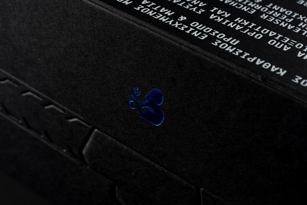
Luminous Design Group designed the seductive packaging for Crocus Collector, a natural cosmetic brand.

“The naming, logo and packaging design for the Crocus Collector range of natural cosmetics. The product range uses as main ingredient the crocus plant, the cultivation of which has a history that spans over three Millennia and is lost in the depths of Mythology where there are dozens of versions of its Origin. In one of the most significant references to Crocus during the Minoan Bronze Age, a fresco of the ‘Crocus Collector’ was found in the NW part of Knossos Palace in Crete, as well as in the ancient City of Akrotiri in Santorini, dating back to 1700 BC. A blue colored monkey is illustrated gently harvesting Crocus Flowers.”
Collector_24.jpgCollector_15.jpgCollector_2.jpgCollector_14.jpg Collector_19.jpg
Collector_20.jpg
Collector_21.jpg
Collector_22.jpg
Collector_13.jpgCollector_16.jpgCollector_26.jpgCollector_17.jpgCollector_11.jpg  

Designed By: Luminous Design Group

Model: Souzi Kouol

Location: Athens, Greece