
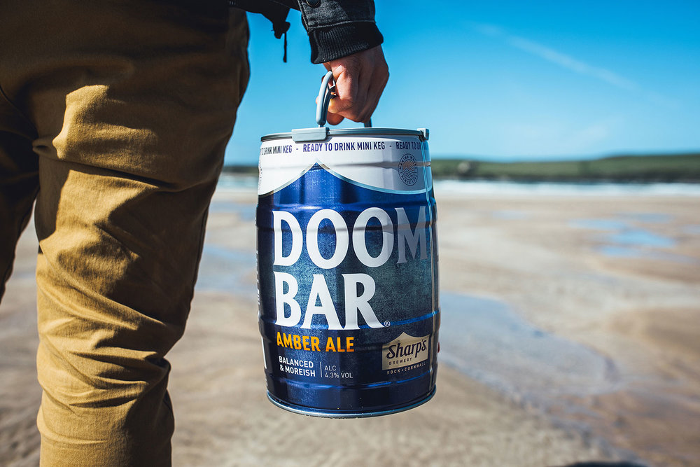
UK-based agency Buddy gave Cornish brewery Sharp’s a brand refresh in order to help differentiate their product line from other craft beers.
“Brand evolutions can be a tricky business, especially when the brand you’re meant to be evolving is already doing very well for itself, thank you. How to move the whole forward while keeping most of the constituent parts the same?
In the case of the Sharp’s premium beer range, the existing brand identity was our own, with bottle labels based on the distinctive wave shape we’d created for the brewery’s logo. The look had served Sharp’s well. But, to build recognition nationally for the Cornish brewery, its beers needed to gain traction with the growing market of craft beer drinkers around the UK. The order was for a more contemporary look, with the personality of each sub-brand brought to the fore.”


“We obviously didn’t want to shake things up too much. With Sharp’s’ multi-award-winning amber ale, Doom Bar, as our model, we introduced a more contemporary typographic layout and a background illustration of an abstract seascape, different for each ale, to switch the visual emphasis from the brewery to its individual sub-brands.”


“As part of the review, we also carried out a dramatic rebranding of Sharp’s Cornish Pilsner, to pitch it against bigger, more exotic names such as Peroni and Estrella, and smaller, craft lager competitors. The new name – Offshore – brings it in line with the coastal theme of the core range, and with a background of sea spray excerpted from a painting by Cornish artist Neil Cannon, captures the pilsner’s crisp, cool refreshment.”


Designed By: Buddy
Location: Exeter, UK
No comments:
Post a Comment