
By: Fred Hart
Expo East, the largest natural and organic food and beverage trade show on the east coast, just concluded its boisterous 3-day extravaganza in Baltimore with aisle after aisle stacked with grain-free this, keto that, and protein pretty much unnecessarily jam-packed into all things everywhere.
With so much going on in the food and beverage space, it’s getting harder and harder to stand out in a meaningful way. Thankfully, more and more brands are harnessing the power of design to tell their story and fight the competition so they can hopefully resonate with consumers eyes and stomachs.
Here’s a look at seven of our favorite brands from the show floor, food samples not included.

Peckish
In a food world constantly being reinvented, reimagined and re-engineered, it’s incredibly refreshing to see the return of the humble yet mighty egg. Peckish is making eggs egg-citing (you had to know that was coming) by pairing them with crispy, crunchy, flavorful dips. The design is a memorable mix of illustrations with an egg visually reduced to its most iconic form, exuding graphic confidence seldom seen in the grocery store. It all hangs together and still creates appetite appeal. One bite and you’ll be scrambling for more (yes, another bad pun, get over it).
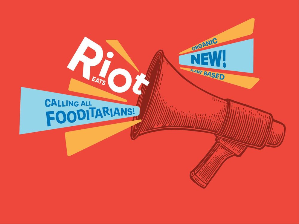
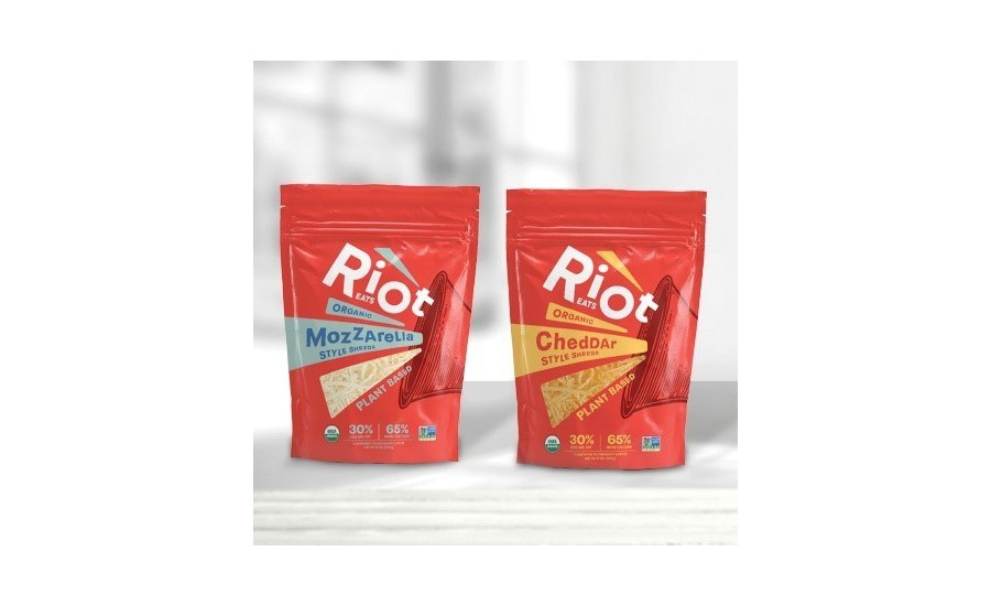
Riot Eats
For too long, the vegan cheese category has led a boring life. Meanwhile, dairy-based cheeses continually tell the same somber stories of heritage and quality. In order to upend the plain ol’ cheese world while celebrating plant-based ones, Riot Eats—formerly Go Veggie—unveiled a triumphant celebratory redesign. Aimed at an adventurous audience of fooditarians, they use a bold, new brand color, a megaphone brandmark and a name that all work in sync to get the message out.


Halo Sport
How do you fight Goliath? You start by upgrading your arsenal.
Even today, Gatorade maintains a 75% market share of the sports drink category. That’s where Halo Sport comes in. A new sports drink formulated and designed for the modern-day consumer’s life, its branding is simple and lifestyle-oriented, while packing an aesthetically powerful punch made to go toe-to-toe with the giant.

Rise Up Coffee
The coffee category just got a jolt of fresh energy thanks to Rise Up Coffee. The Maryland-based company overhauled their brand and ended up in an incredibly bold and graphic territory that’s as stimulating as their cup-of-Joe. A black and white, retro-inspired, Lichtenstein-esque illustration is highlighted by beautiful pops of colored typography, with easy to navigate text. They’ve created something all too uncommon—their own unique visual language in coffee.

Smart Flour Foods
Do you want to know the way to America’s heart?
Pizza. Fun, delicious pizza.
But somewhere along the way, the frozen pizza category forgot to focus on anything outside of stringy cheese shots and overhead pizza photography. Smart Flour Foods, driven by their love of pizza, wanted to bring life back to the frozen aisle. Fueled by a foundation of ancient grains crust (shhh, it’s also gluten-free), its redesign places a strong emphasis on the thing people care most about - the toppings. Those toppings then inspire the lively patterns used to break up the monotony at the shelf, and have kids and moms, clamoring for more. Pizza, pizza!

Nolita
Move over, tater-tots, there’s a new sheriff in town. Nolita is a line of incredibly delicious cauliflower bites made from cauliflower (duh), egg whites, cheese, almond flour, onion, and seasoning. These low-carb, never fried, morsels of goodness inspire a carefree and lighthearted design system that invites you to come and sit down at the family table, yet has a whimsical I-got-it-off–Etsy-chic.

A Dozen Cousins
It doesn’t get more basic than beans unless, of course, you’re talking about Uggs and pumpkin-spice lattes, but that’s another story entirely.
A staple in American cupboards, beans have been in dire need of a refresh. A Dozen Cousins officially launched at Expo East to great fanfare, and not just because the product inside the bag is addicting. The brand is wonderfully optimistic, familial and upbeat with a logo that represents a family coming together around food. The color palette, photography, and illustration work harmoniously together and redefine the consumer experience and expectation. We never thought we’d want to tear into a plate of beans, but there you have it.

Fred Hart
Fred Hart is a Partner and Creative Director at Interact Boulder – a spirited branding agency obsessed with the food and beverage industry that’s fueled by a steady, 24-hour diet of tastemakers, entrepreneurs, grocery stores, farmers markets, restaurants and more.
No comments:
Post a Comment