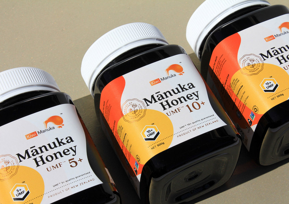
Kiwi Manuka® ’s honey products draw from the knowledge of New Zealand’s indigenous Maori people, as they have used Mānuka in their traditional medicine for centuries. Together with the development of modern research and clinical study, the brand Kiwi Manuka® was born.
Kiwi Manuka® brings together a unique blend of cultural heritage and modern technology to deliver a range of natural, honey based care products beneficial for health and wellbeing. With Mānuka honey being one of the core hero products of this brand, it was important for this packaging design to demonstrate the core vision and the background story of the brand. The elements of the Mānuka Honey packaging also have influence on the overall brand portfolio.
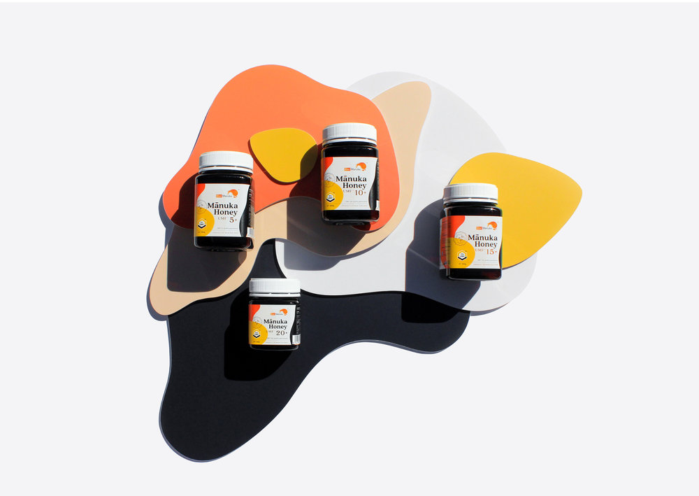
It was a challenging task to give an identity to such a richly cultured product. It was vital to show that this prized raw material is not just like any other honey, but it is a product containing the best ingredients and backed by scientific research from New Zealand. The intention is to express the complexity of the brand’s origin and introduce our perspective. The various dynamic geometric shapes have been illustrated as symbolisation throughout the core honey packaging series. Each delicate shape represents the key ingredients and ties in the strategic locations of the brands background and source.
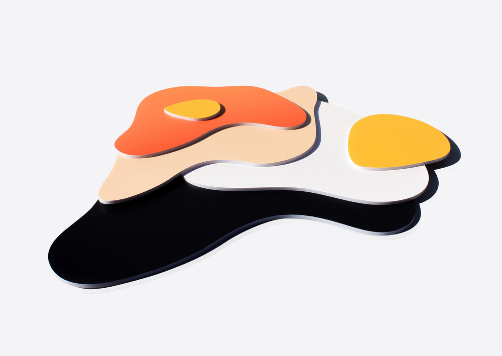
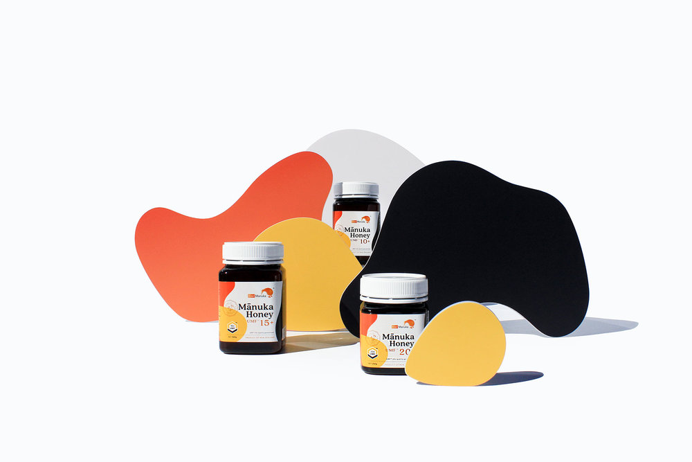
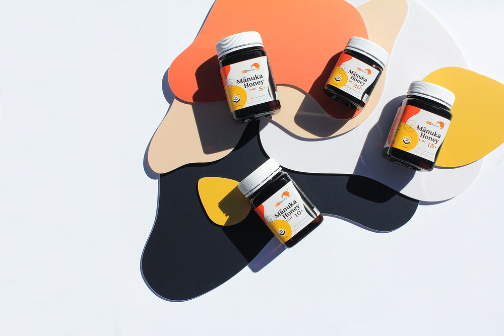

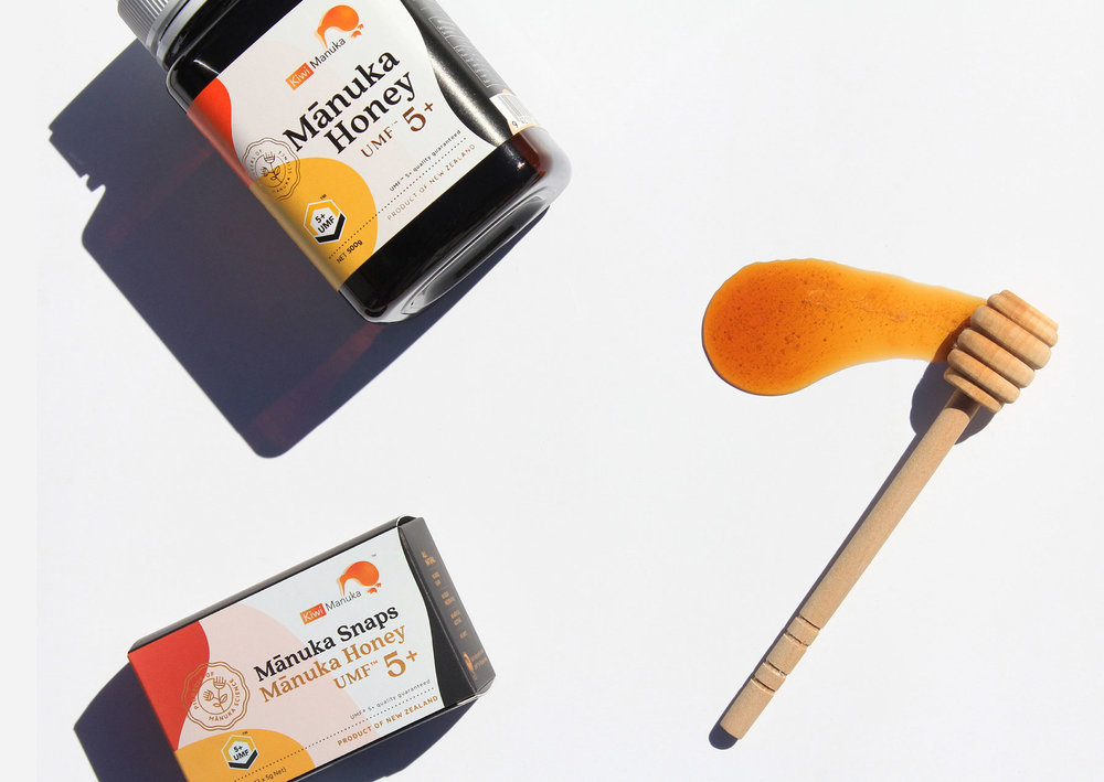
To emphasis unique characteristics and flavours of each product, an emblem was designed and dedicated to each category of honey, then carefully laid out onto the packaging. The emblem works as a symbol to differentiate each category of honey with careful attention to placement to ensure it translates our core message of quality and origin.
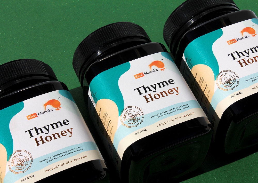
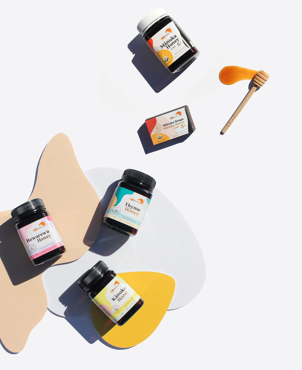
Colour also plays an essential role in the brands visual identity. In order to present the natural and organic flavours of the brand, a pastel colour palette has been developed and used across the honey range. Mānuka Honey has the richest taste among all other products, hence the most vibrant colour is used to differentiate them from other floral honeys.
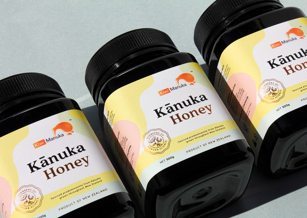
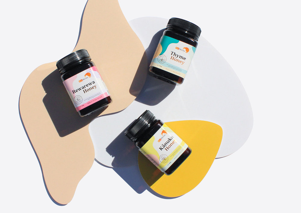
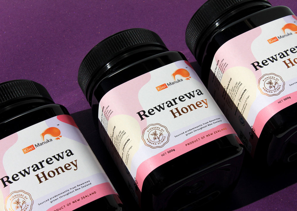
The selection of colour palette for floral honey was inspired by the characteristics of the particular flower. The colour scheme does not only bring across a natural, modern and aesthetic look, but it also introduces the youthful approach and vision that is Kiwi Manuka®.
Typeface on the packaging was carefully selected, due to the high level of information being used on such a small layout, visibility was key.
By combining all the above elements into the honey label, the packaging design tells the story of the honey in a creative and artistic way, while keep it fun and approachable. From this foundation, a complete set of visual identity elements was created to serve the purpose of demonstrating the brands identity.
Designed By: KOP Studio
Art Director & Creative Director: Kevin Lam
Designer: Kevin Lam & Jean Wong
Location: Brisbane, Australia
No comments:
Post a Comment