
Kuudes Helsinki & Stockholm designed this standout packaging for Fazer, a beloved Finnish brand.
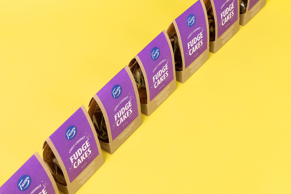
“Fazer is a Finnish icon with dozens of products that are household favourites in Finland. Kuudes was given the task to design an appealing look for their new product line, hand-made premium treats. The idea in the communication is ‘less but more’: how such tiny treats can produce big, intensive flavours?”


“The first thing you see is an eye-catching, vibrant colour on an earthy cardboard material. Just like in the treats, there’s a sweet surprise: you find another cheery colour on the flip side of the cardboard shell. The crumbs chipping off the typography give a playful touch to the design together with the slightly witty copywriting. The result is a simple but tempting and fun design that’s definitely ‘less, but more.’”


Designed By: Kuudes Helsinki & Stockholm
Location: Helsinki, Finland
No comments:
Post a Comment