
Goods & Services Branding designed this elegant and unique take on playing cards as an internal project and the results are stunning. Each deck of cards were designed with a specific card game in mind, but the real star of the show is the beautiful custom typography that adorns each of the cards.


“For this project, we wanted to reimagine what playing cards could look like if they were designed for specific games. We selected four different games-Solitaire, Poker, Hearts and Crazy Eights-and created custom decks for each. The aim was to highlight the roles that each card plays in its game, without removing the cards’ functionality for any other game.”

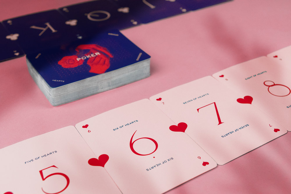

“The result was a set of four unique decks, complete with a custom typeface, ‘Flush,’ for the numbers and rules for each game.
The entire project was digitally printed on Canada’s first Konica Minolta KM-1 short-run UV inkjet press. Using digital printing allowed us to collate the decks inline, which contributed to the efficiency and accuracy of the process.”


“We used block-out paper to ensure the integrity of the faces (i.e., so there would be no show-through), with an AQ coating to give them the appropriate finish to be used as playing cards.
For the packaging, we sourced vintage, 40-year-old metal closures; their style and patina reinforced the overall heritage look and feel for the package.”

Designed By: Goods & Services Branding
Art Director: Carey George
Designers: Nic Bradford, Taylor Toth, Derek Moxon
Printer: Flash Reproductions
Content: Mike Barber, Sue McCluskey, Erinn Steringa
Production: Derek Moxon
Project Management: Sam Croll
Location: Canada
No comments:
Post a Comment